2020 REBRAND AND MARKETING STRATEGY FOR A ROOT BEER COMPANY
LOGOS ● BRANDING ● DIGITAL ILLUSTRATION ● Marketing Materials
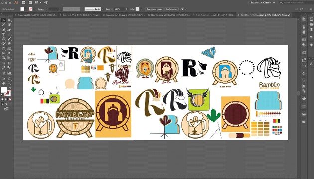
Case Study: Ramblin’ Root Beer
Ramblin Root Beer is a classic beverage to which needed a fresh look to keep up with the times. Diaz Designz demonstrates an out of the box design that helps bring Ramblin’ stand out from its competition. The best part of the new brand identity is that it can hold its design even at the mobile icon level.
OBJECTIVE
Create a new brand identity for the Ramblin’ Root Beer by implementing UI/UX processes. Within the UI/UX processes this rebrand consisted of a few assets that needed to be used for the final creation, to include mockups for this case study. All of the assets created are also a great example of useful marketing materials.
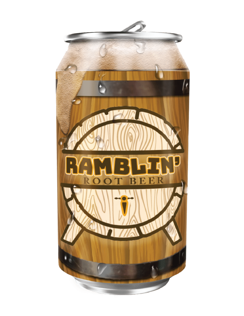
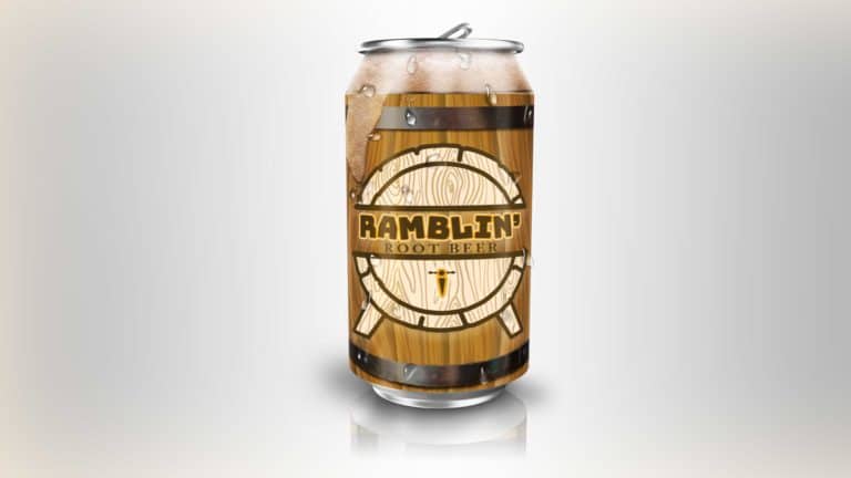
My inspiration for the Ramblin’ Root Beer logo was sound. I pictured the ramblin’ sound that a wooden barrel makes while being rolled around in a warehouse as a focal point to the overall design. The color palette that I chose also comes from the overall colors of a barrel.
The design demonstrates the shape and wood grain detail that resembles a barrel as well. The spout and stands are from an old barrel design the medieval Europeans used before root beer was created and held alcoholic beer for people to drink.
TYPE AND COLOR PALETTE
For the word “Ramblin'” I chose the font Bungee and I tilted every other letter to resemble movement. For the words “Root Beer”, I chose the font EB Garamond Medium because although it displays an opposing effect with a serif against the Bungee san serif font, it works together.
Marketing Materials
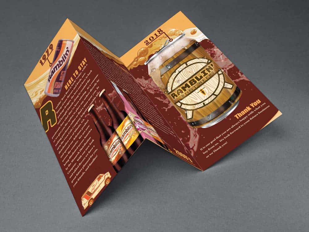
No business can survive without marketing themselves. Whether a business decides to use radio, television, social media, or good old fashioned paper for brochures it helps attract consumers to the brand. Diaz Designz’s designed the Ramblin’ Root Beer brochure to ensure that not only the colors matched, but the typography was easy to read and flow across each section of the design.
Front
Back
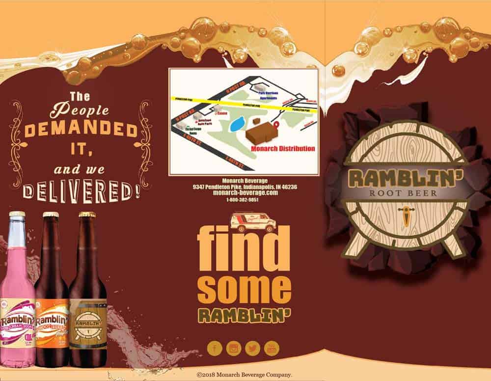
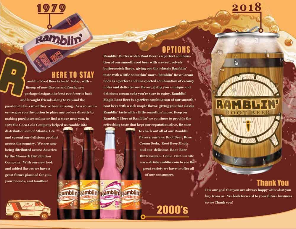
The Tri-Fold Brochure Design
In addition to the overall design, this tri-fold brochure is filled with historical information, a message to the consumer, and even contact information for the distribution center.
The outside of the brochure matches the flow of the foam on top as you fold and unfold towards the outside content.
On the front cover, the logo displays the effect of coming out from the paper. I wanted to demonstrate this because the word “ramblin'” brings movement to mind.
The outside center displays the location of the distribution center (applied in 3D), along with the basic contact information. Some type effect carries the history of Ramblin’ Root Beer with the iconic van, ending with a call to action that brings attention to social media.
A thank you message to the consumer is given by a pull quote. The type treatment sends the message that Ramblin’ listens to its audience and is willing to give them what they want.